布局
默认幻灯片的布局是页面居中展示,这在大多数情况下是适用的,并且还默认支持了半屏背景和两栏布局等特殊布局。如果想要更灵活的布局,在本插件中需要了解一些 CSS 的知识和一些 Tailwind CSS 的知识。
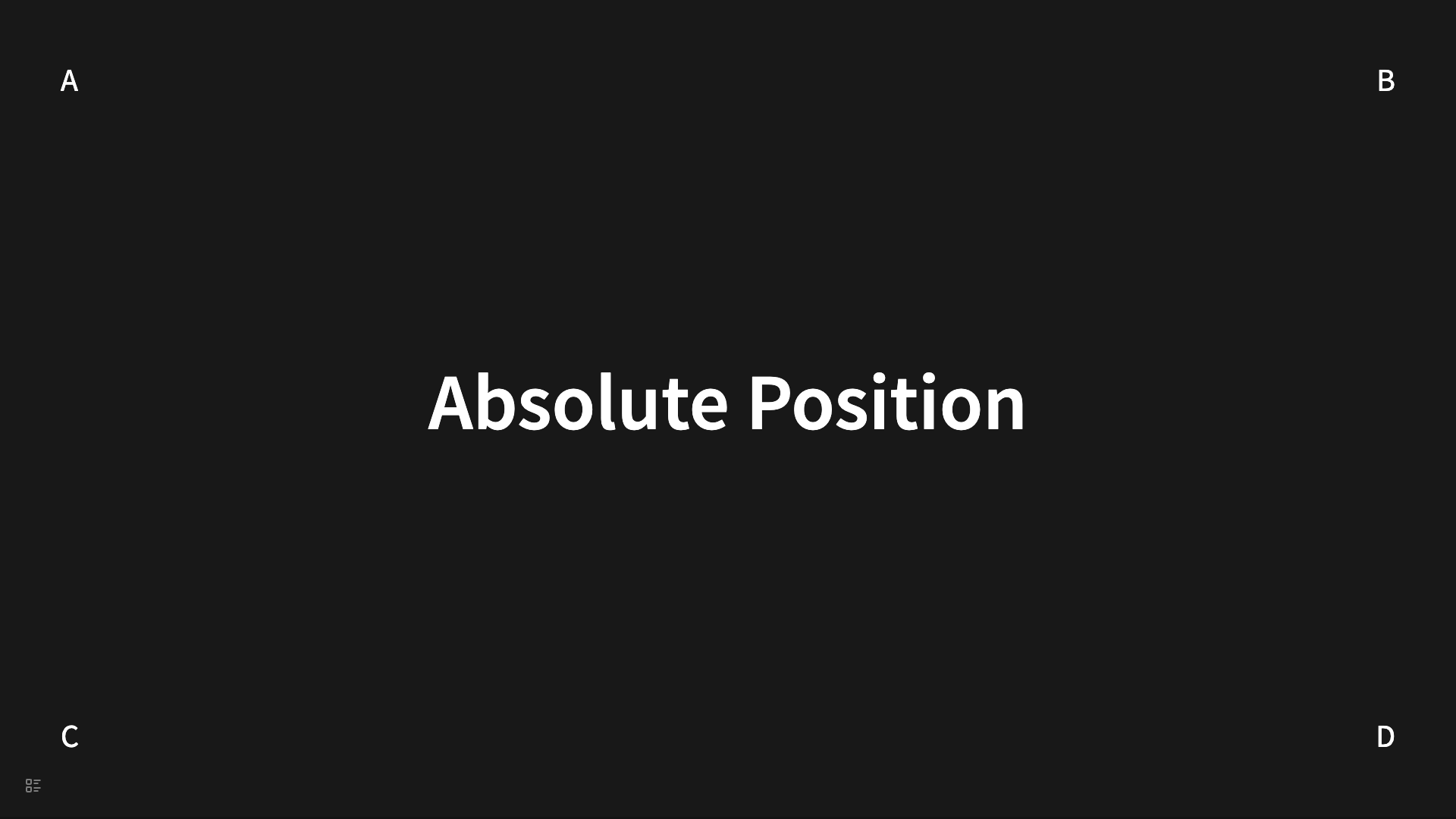
绝对定位
这是一种常见的需求,就是希望指定的节点,显示在页面的任意位置上,这个需要使用绝对定位来实现。这是一种 CSS 技巧和配合 Tailwind CSS 的实现。例如:
- # Absolute Position
  data-section-class:: !relative
  data-child-class:: !w-fit !absolute
	- A
	  data-class:: !top-20 !left-20
	- B
	  data-class:: !top-20 !right-20
	- C
	  data-class:: !bottom-20 !left-20
	- D
	  data-class:: !bottom-20 !right-20
会被渲染成
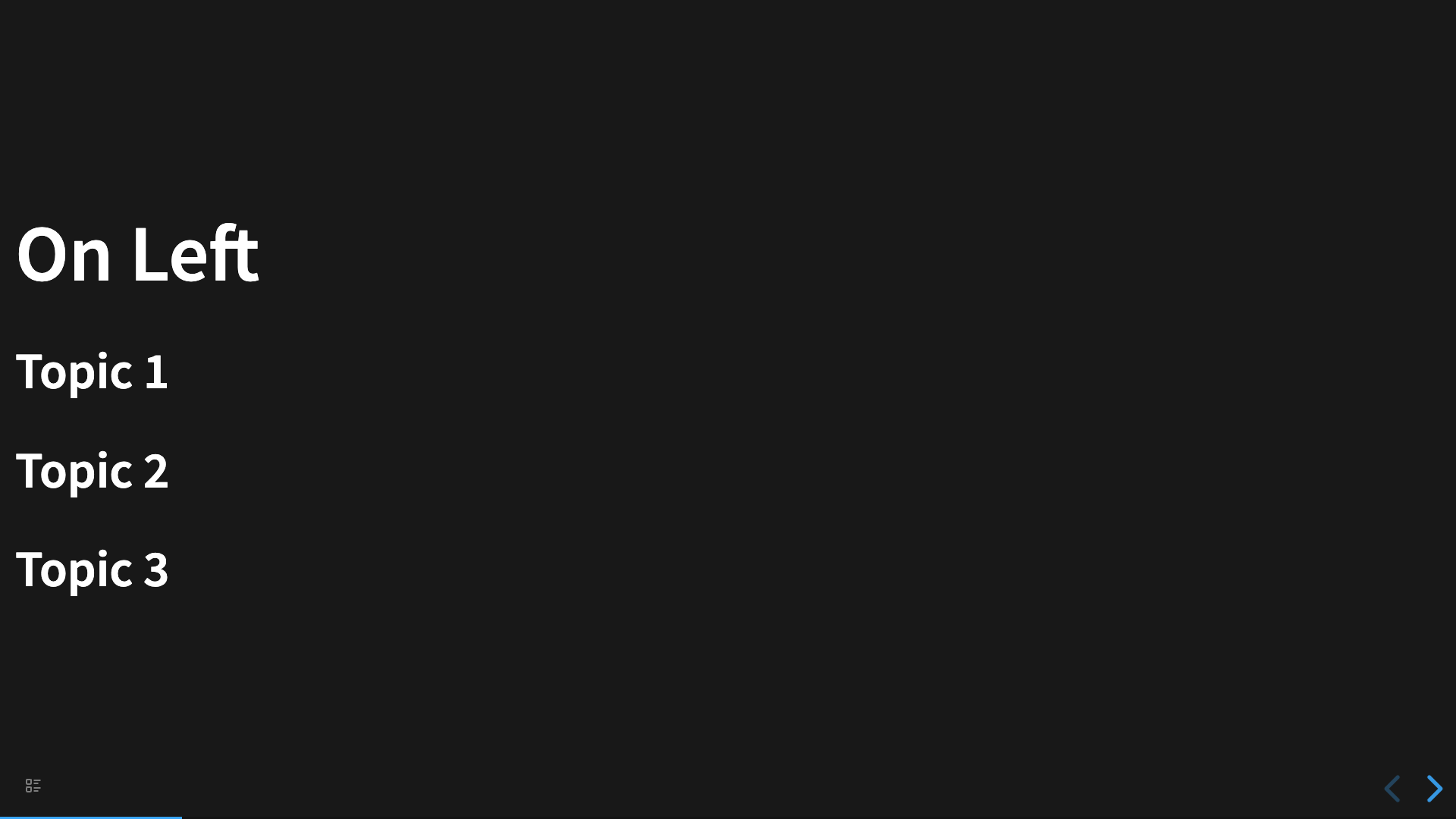
Flex 布局
Flex 布局是一种常见的布局方式,幻灯片每个 <section> 都是一个 flex 容器,因此我们比较容易的实现 Flex 布局。插件提供了默认布局设置,用户也可以为每个幻灯片通过属性来设置不同的布局。
- # On Left
  data-layout:: left
	- ## Topic 1
	- ## Topic 2
	- ## Topic 3
会被渲染成
那么猜猜下面的幻灯片是什么布局?
- # On Bottom Right
  data-section-class:: !justify-end !items-end
  data-child-class:: !text-right
  data-class:: !text-right
	- ## Topic 1
	- ## Topic 2
	- ## Topic 3
网格布局
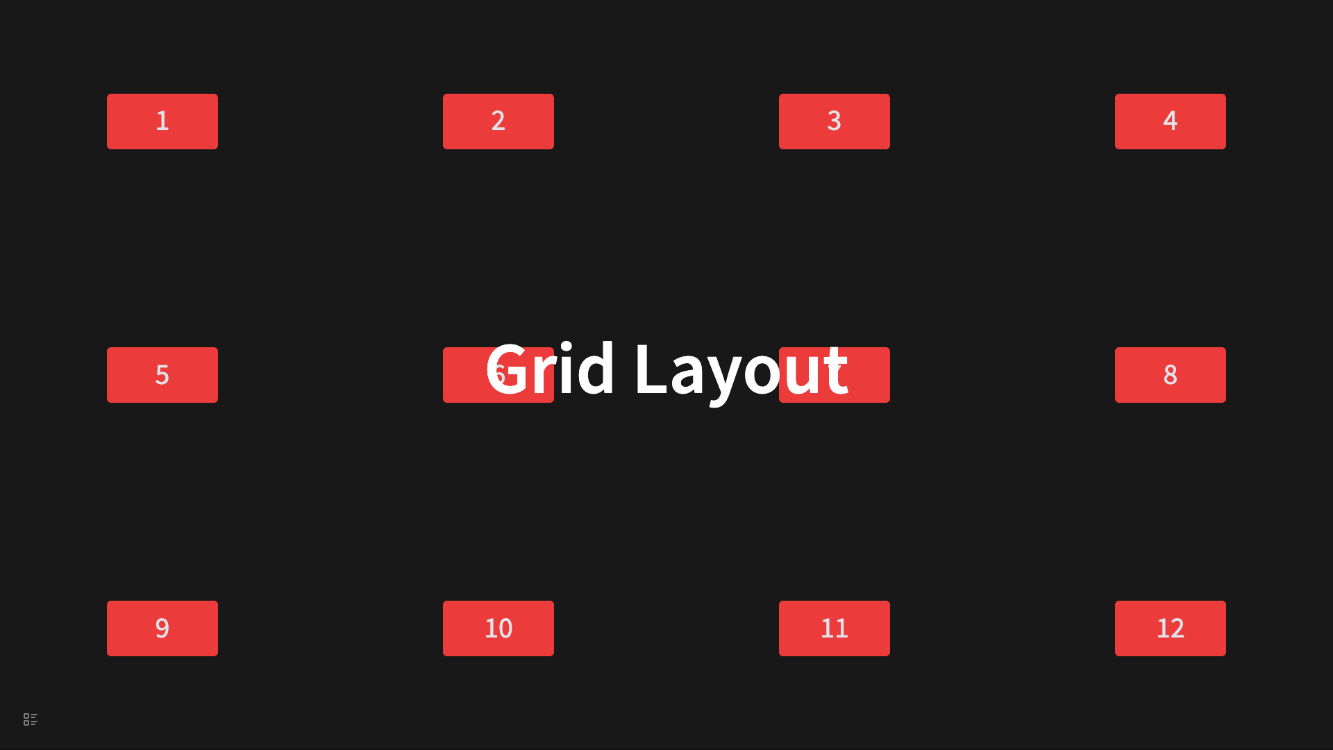
网格布局不是默认原生支持的,但是借助 Tailwind CSS 的 类,是可以实现的。
- # Grid Layout
  data-class:: !absolute !left-1/2 !-translate-x-1/2
  data-section-class:: !grid !grid-cols-4 !gap-4
  data-child-class:: !bg-red-500 !rounded-md !text-gray-200 !w-40 !h-20 !mx-auto !flex !justify-center !items-center
	- 1
	- 2
	- 3
	- 4
	- 5
	- 6
	- 7
	- 8
	- 9
	- 10
	- 11
	- 12
会被渲染成
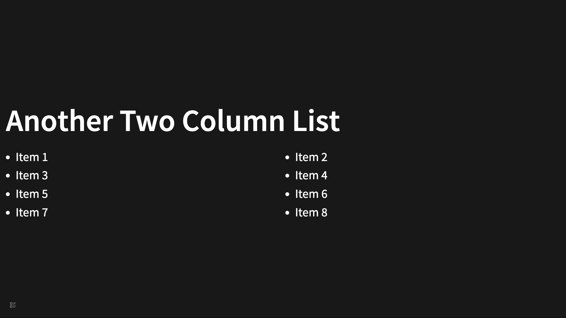
使用网格布局实现双栏布局
- # Another Two Column List
  data-list-class:: !grid !grid-cols-2 !gap-2 !w-full !px-4
  data-child-class:: !ml-4
  data-class:: !text-left
  data-list:: true
	- Item 1
	- Item 2
	- Item 3
	  collapsed:: true
	- Item 4
	- Item 5
	- Item 6
	- Item 7
	- Item 8